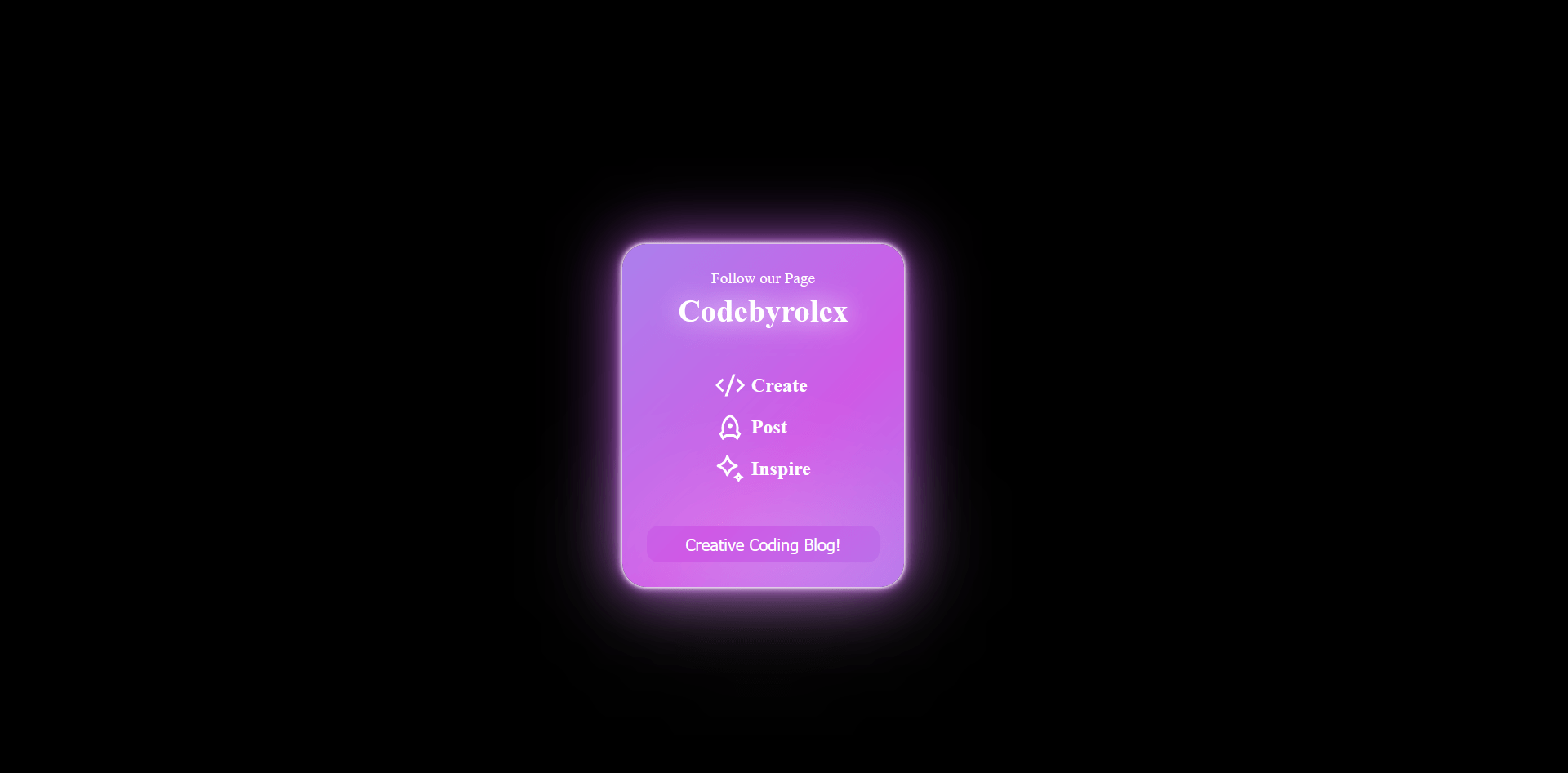
Creating a Glowing, Responsive Card with HTML and CSS
In the fast-paced world of web design, capturing your audience’s attention and ensuring your content looks great on all devices are top priorities. One effective way to achieve this is by designing a responsive card with a captivating glowing effect using HTML and CSS.
HTML Structure:
Begin by setting up the HTML structure with a container that encloses your card. This simple structure serves as the foundation for the glowing effect.
Styling with CSS:
CSS is where the magic happens. Define the card’s appearance, create appealing background gradients, and implement the glowing effect. You can experiment with text styles and animations to make your card truly stand out.
Responsiveness:
Modern design demands responsiveness. Use CSS media queries to ensure your card adapts gracefully to various screen sizes. Regardless of the device, your card will impress.
Steps to Create a responsive card with a glowing effect using html and css
1: Create a folder . name whatever you want to give you can give. and create these files which is mentioned bellow under main folder.
2: Create index.html in main file and make sure your extention should be .html .
3: Create style.css in main file and make sure your extention should be .css
NOTE: if you have any issue or doubt so please contact us or leave your valueable comment
Here is index.html
<!DOCTYPE html>
<html lang="en">
    <!-- visit  wwww.codebyrolex.com  -->
<head>
    <meta charset="UTF-8">
    <meta name="viewport" content="width=device-width, initial-scale=1.0">
    <title>how to create a responsive card with a glowing effect using html and css - Codebyrolex</title>
    <link rel="stylesheet" href="style.css">
</head>
<body>

    <div class="card">
        <div class="heading">Follow our Page <span>Codebyrolex</span></div>
        <div class="content">
            <div class="item item--create">
                <svg height="24" width="24" viewBox="0 0 24 24" xmlns="http://www.w3.org/2000/svg">
                    <path d="M24 12L18.3431 17.6569L16.9289 16.2426L21.1716 12L16.9289 7.75736L18.3431 6.34315L24 12ZM2.82843 12L7.07107 16.2426L5.65685 17.6569L0 12L5.65685 6.34315L7.07107 7.75736L2.82843 12ZM9.78845 21H7.66009L14.2116 3H16.3399L9.78845 21Z" fill="currentColor"></path>
                </svg>
                <span>Create</span>
            </div>
            <div class="item item--post">
                <svg height="24" width="24" viewBox="0 0 24 24" xmlns="http://www.w3.org/2000/svg">
                    <path d="M4.99958 12.9998C4.99958 7.91186 7.90222 3.56348 11.9996 1.81787C16.0969 3.56348 18.9996 7.91186 18.9996 12.9998C18.9996 13.8227 18.9236 14.6263 18.779 15.4026L20.7194 17.2352C20.8845 17.3911 20.9238 17.6388 20.815 17.8381L18.3196 22.4132C18.1873 22.6556 17.8836 22.7449 17.6412 22.6127C17.5993 22.5898 17.5608 22.5611 17.5271 22.5273L15.2925 20.2927C15.1049 20.1052 14.8506 19.9998 14.5854 19.9998H9.41379C9.14857 19.9998 8.89422 20.1052 8.70668 20.2927L6.47209 22.5273C6.27683 22.7226 5.96025 22.7226 5.76498 22.5273C5.73122 22.4935 5.70246 22.4551 5.67959 22.4132L3.18412 17.8381C3.07537 17.6388 3.11464 17.3911 3.27975 17.2352L5.22014 15.4026C5.07551 14.6263 4.99958 13.8227 4.99958 12.9998ZM6.47542 19.6955L7.29247 18.8785C7.85508 18.3159 8.61814 17.9998 9.41379 17.9998H14.5854C15.381 17.9998 16.1441 18.3159 16.7067 18.8785L17.5237 19.6955L18.5056 17.8954L17.4058 16.8566C16.9117 16.39 16.6884 15.7044 16.8128 15.0363C16.9366 14.3721 16.9996 13.691 16.9996 12.9998C16.9996 9.13025 15.0045 5.69953 11.9996 4.04021C8.99462 5.69953 6.99958 9.13025 6.99958 12.9998C6.99958 13.691 7.06255 14.3721 7.18631 15.0363C7.31078 15.7044 7.08746 16.39 6.59338 16.8566L5.49353 17.8954L6.47542 19.6955ZM11.9996 12.9998C10.895 12.9998 9.99958 12.1044 9.99958 10.9998C9.99958 9.89525 10.895 8.99982 11.9996 8.99982C13.1041 8.99982 13.9996 9.89525 13.9996 10.9998C13.9996 12.1044 13.1041 12.9998 11.9996 12.9998Z" fill="currentColor"></path>
                </svg>
                <span>Post</span>
            </div>
            <div class="item item--inspire">
                <svg height="24" width="24" viewBox="0 0 24 24" xmlns="http://www.w3.org/2000/svg">
                    <path d="M10.6144 17.7956C10.277 18.5682 9.20776 18.5682 8.8704 17.7956L7.99275 15.7854C7.21171 13.9966 5.80589 12.5726 4.0523 11.7942L1.63658 10.7219C.868536 10.381.868537 9.26368 1.63658 8.92276L3.97685 7.88394C5.77553 7.08552 7.20657 5.60881 7.97427 3.75892L8.8633 1.61673C9.19319.821767 10.2916.821765 10.6215 1.61673L11.5105 3.75894C12.2782 5.60881 13.7092 7.08552 15.5079 7.88394L17.8482 8.92276C18.6162 9.26368 18.6162 10.381 17.8482 10.7219L15.4325 11.7942C13.6789 12.5726 12.2731 13.9966 11.492 15.7854L10.6144 17.7956ZM4.53956 9.82234C6.8254 10.837 8.68402 12.5048 9.74238 14.7996 10.8008 12.5048 12.6594 10.837 14.9452 9.82234 12.6321 8.79557 10.7676 7.04647 9.74239 4.71088 8.71719 7.04648 6.85267 8.79557 4.53956 9.82234ZM19.4014 22.6899 19.6482 22.1242C20.0882 21.1156 20.8807 20.3125 21.8695 19.8732L22.6299 19.5353C23.0412 19.3526 23.0412 18.7549 22.6299 18.5722L21.9121 18.2532C20.8978 17.8026 20.0911 16.9698 19.6586 15.9269L19.4052 15.3156C19.2285 14.8896 18.6395 14.8896 18.4628 15.3156L18.2094 15.9269C17.777 16.9698 16.9703 17.8026 15.956 18.2532L15.2381 18.5722C14.8269 18.7549 14.8269 19.3526 15.2381 19.5353L15.9985 19.8732C16.9874 20.3125 17.7798 21.1156 18.2198 22.1242L18.4667 22.6899C18.6473 23.104 19.2207 23.104 19.4014 22.6899ZM18.3745 19.0469 18.937 18.4883 19.4878 19.0469 18.937 19.5898 18.3745 19.0469Z" fill="currentColor"></path>
                </svg>
                <span>Inspire</span>
            </div>
        </div>
        <button>Creative Coding Blog!</button>
    </div>

</body>
</html>Here is style.css
/* visit  wwww.codebyrolex.com */
.card {
    position: relative;
    box-sizing: border-box;
    background: linear-gradient(-45deg,#6bc5f8, #cf59e6,#6bc5f8, #cf59e6);
    animation: gradient 5s ease infinite;
    background-size: 500% 500%;
    width: 230px;
    height: 280px;
    display: flex;
    align-items: center;
    justify-content: space-between;
    flex-direction: column;
    padding: 20px;
    border-radius: 20px;
  }

  @keyframes gradient {
    0% {
      background-position: 0 50%;
      box-shadow: 0px 0px 2px #ffffff,
        0px 0px 5px #ffffff,
        0px 0px 10px #6bc5f8,
        0px 0px 50px #6bc5f8;
    }

    50% {
      background-position: 100% 50%;
      box-shadow: 0px 0px 2px #ffffff,
        0px 0px 5px #ffffff,
        0px 0px 10px #cf59e6,
        0px 0px 50px #cf59e6;
    }

    100% {
      background-position: 0 50%;
      box-shadow: 0px 0px 2px #ffffff,
            0px 0px 5px #ffffff,
            0px 0px 10px #6bc5f8,
            0px 0px 50px #6bc5f8;
    }
  }

  .heading {
    color: white;
    font-weight: 500;
    font-size: 0.8em;
    display: flex;
    flex-direction: column;
    justify-content: center;
    align-items: center;
    gap: 5px;
  }

  .heading span {
    font-size: 2em;
    font-weight: 800;
    filter: drop-shadow(0px 0px 10px rgb(255, 255, 255));
    animation: flickering 2s linear infinite both;
  }

  @keyframes flickering {
    0%,
    100% {
      opacity: 1;
    }

    41.99% {
      opacity: 1;
    }

    42% {
      opacity: 0;
    }

    43% {
      opacity: 0;
    }

    43.01% {
      opacity: 1;
    }

    47.99% {
      opacity: 1;
    }

    48% {
      opacity: 0;
    }

    49% {
      opacity: 0;
    }

    49.01% {
      opacity: 1;
    }
  }

  .content {
    display: flex;
    flex-direction: column;
    justify-content: center;
    align-items: flex-start;
    height: fit-content;
    gap: 10px;
  }

  .item {
    color: white;
    font-weight: 600;
    display: flex;
    align-items: center;
    justify-content: center;
    gap: 5px;
    cursor: default;
  }

  .item svg {
    transition-duration: .3s;
  }

  .item:hover svg {
    filter: drop-shadow(0px 0px 10px white);
    transition-duration: .3s;
  }

  button {
    width: 100%;
    height: 30px;
    background-color: transparent;
    border: none;
    border-radius: 10px;
    color: white;
    cursor: pointer;
    position: relative;
    display: flex;
    align-items: center;
    justify-content: center;
    box-shadow: 0px 0px 100px white;
    transition-duration: .3s;
  }

  button:hover {
    letter-spacing: 1.5px;
    transition-duration: .3s;
  }
Conclusion:
Web design offers a canvas for creativity. Play with colors, fonts, and animations to create visually striking, responsive cards. As you explore the world of web development, you’ll discover countless opportunities to engage and captivate your audience. The stage is set—it’s your time to craft glowing, responsive cards that leave a lasting impression.