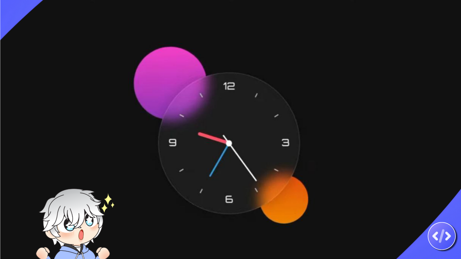
Introducing my Glassmorphism Analog Clock—crafted with HTML, CSS, and JavaScript. Combining elegant design and precision timekeeping, it’s a functional work of art.
HTML structures it, CSS adds style, and JavaScript ensures seamless timekeeping. Watch the hands move gracefully, invoking nostalgia and tranquility. This project enhanced my web development skills.
This clock brings joy and inspiration, showcasing beauty in coding. Embracing glassmorphism, it proves function and aesthetics can coexist in the digital world.
Steps to create glassmorphism analog digital clock in html css javascript
follow the steps which is mentioned bellow and you can join our telegram channel
1: Create a folder you can give any name to the file. And then create a index.html file for html code.
2: Create style.css file in main file make sure extention must be .css
3: Create script.js file in main file . it is for javascript code.
4: download clock png and store in main file.
here is index.html
<!DOCTYPE html>
<html lang="en">
<head>
    <!-- CodeByRolex – Creative Coding blog  | Visit our website www.codebyrolex.com -->
    <meta charset="UTF-8">
    <meta name="viewport" content="width=device-width, initial-scale=1.0">
    <title>Glassmorphism-Analog-Clock-using-html-CSS-and-JavaScript</title>
    <link rel="stylesheet" href="/style.css">
</head>
<body>
    <div class="container">

        <div class="circle"></div>
        <div class="circle"></div>

        <div class="clock">
            <div class="clock-bg">
                <img src="/clock.png" alt="clock png">
            </div>
            <div class="hour">
                <span class="hr" id="hr"></span>
            </div>
            <div class="minute">
                <span class="min" id="min"></span>
            </div>
            <div class="second">
                <span class="sec" id="sec"></span>
            </div>
        </div>

    </div>

    <!-- JS File -->
    <script type="text/javascript" src="/script.js"></script>
</body>
</html>here is style.css
* {
    margin: 0;
    padding: 0;
    box-sizing: border-box;
}
/* CodeByRolex – Creative Coding blog  | Visit our website www.codebyrolex.com */
body {
    height: 100vh;
    display: flex;
    align-items: center;
    justify-content: center;
    background: #111;
}

.container {
    position: relative;
}

.container .circle {
    position: absolute;
    border-radius: 50%;
    pointer-events: none;
    animation: 2s ease-in infinite alternate;
}

.container .circle:nth-child(1) {
    width: 180px;
    height: 180px;
    top: -60px;
    left: -60px;
    background: linear-gradient(
        #e524c3, #8626b2
    );
    animation-name: move-up;
}

@keyframes move-up {
    to {
        transform: translateY(-10px);
    }
}

.container .circle:nth-child(2) {
    width: 120px;
    height: 120px;
    bottom: -20px;
    right: -20px;
    background: linear-gradient(
        #d64612, #e48307
    );
    animation-name: move-down;
}

@keyframes move-down {
    to {
        transform: translateY(10px);
    }
}

.clock {
    width: 350px;
    height: 350px;
    display: flex;
    align-items: center;
    justify-content: center;
    border: 2px solid rgba(255, 255, 255, .1);
    border-radius: 50%;
    backdrop-filter: blur(15px);
    background: rgba(255, 255, 255, .05);
    box-shadow: 0 0 30px rgba(0, 0, 0, .2);
}

.clock .clock-bg img {
    width: 100%;
    height: 100%;
}

.clock::before {
    content: '';
    position: absolute;
    width: 15px;
    height: 15px;
    background: #fff;
    border-radius: 50%;
    z-index: 15;
}

.clock .hour,
.clock .minute,
.clock .second {
    position: absolute;
}

.clock .hour,
.clock .hour .hr {
    width: 160px;
    height: 160px;
}

.clock .minute,
.clock .minute .min {
    width: 190px;
    height: 190px;
}

.clock .second,
.clock .second .sec {
    width: 230px;
    height: 230px;
}

.clock .hour .hr,
.clock .minute .min,
.clock .second .sec {
    display: flex;
    justify-content: center;
    position: absolute;
    border-radius: 50%;
}

.clock .hour .hr::before {
    content: '';
    position: absolute;
    width: 8px;
    height: 80px;
    background: #ff3d68;
    z-index: 10;
    border-radius: 10px;
}

.clock .minute .min::before {
    content: '';
    position: absolute;
    width: 4px;
    height: 90px;
    background: #39a2db;
    z-index: 11;
    border-radius: 8px;
}

.clock .second .sec::before {
    content: '';
    position: absolute;
    width: 3px;
    height: 140px;
    background: #fff;
    z-index: 12;
    border-radius: 2px;
}
here is script.js
const degree = 6;
const hr = document.querySelector('#hr');
const min = document.querySelector('#min');
const sec = document.querySelector('#sec');

setInterval(() => {

    const date = new Date();
    const hh = date.getHours() * 30;
    const mm = date.getMinutes() * degree;
    const ss = date.getSeconds() * degree;

    hr.style.transform = `rotateZ(${hh + (mm / 12)}deg)`;
    min.style.transform = `rotateZ(${mm}deg)`;
    sec.style.transform = `rotateZ(${ss}deg)`;

});
// CodeByRolex – Creative Coding blog | Visit our website www.codebyrolex.comFinal Words
Thank you for visiting our website hope you like this post. If you have any doubt releated to this post then please comment or contact us. check out our other post too.