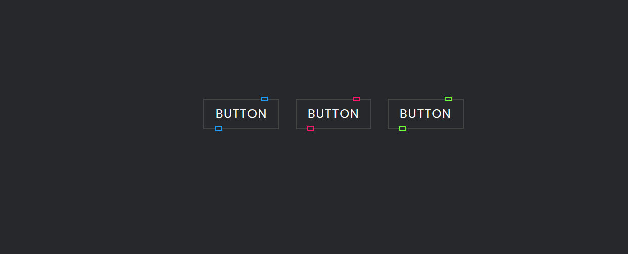
Buttons are crucial for web interactions, and adding eye-catching hover effects can enhance your website’s appeal. Here are three modern glowing button hover effects using HTML and CSS.
- Subtle Glow: This effect offers a clean, professional look. The button starts with a simple design but gains a soft glow on hover, subtly inviting users to click.
- Neon Glow: For a vibrant and attention-grabbing effect, consider the Neon Glow. The button stands out with a bold color, and on hover, it emits a neon-like glow from its edges, making it impossible to ignore.
- Pulse Glow: To convey urgency or importance, the Pulse Glow is ideal. When users hover over the button, it appears to pulse, growing slightly larger with a subtle shadow, creating a sense of dynamism.
Incorporating these modern button hover effects can enhance user experience and aesthetics, depending on your website’s style and goals. Experiment and customize these effects to align with your unique design.
In conclusion, these interactive hover effects provide a creative way to improve your website’s user interface. Whether you prefer a subtle touch, a burst of neon, or a pulsating animation, these effects make your buttons engaging and guide users through your site with style.
Steps To Create Modern glowing button hover effect
1:Create a folder . name whatever you want to give you can give. and create these files which is mentioned bellow under main folder.
2: Create index.html in main file and make sure your extention should be .html .
3: Create style.css in main file and make sure your extention should be .css
NOTE: if you have any issue or doubt so please contact us or leave your valueable comments.
here is index.html
<!DOCTYPE html>
<html lang="en" >
  <!-- Codebyrolex - visit our website www.codebyrolex.com  -->
<head>
  <meta charset="UTF-8">
  <title>Codebyrolex - Modern glowing button hover effect</title>
  <link rel="stylesheet" href="./style.css">

</head>
<body>
<!-- partial:index.partial.html -->
<div class="container">
  <a href="#" style="--color: #1e9bff"><span>Button</span><i></i></a>
  <a href="#" style="--color: #ff1867"><span>Button</span><i></i></a>
  <a href="#" style="--color: #6eff3e"><span>Button</span><i></i></a>
</div>
<!-- partial -->

</body>
</html>
here is style.css
@import url('https://fonts.googleapis.com/css2?family=Poppins:wght@100;300;400;500;600;700;800;900&display=swap');
/* Codebyrolex - visit our website www.codebyrolex.com */
* {
  margin: 0;
  padding: 0;
  box-sizing: border-box;
  font-family: 'Poppins', sans-serif;
}

.container {
  width: 100%;
  min-height: 100vh;
  display: flex;
  justify-content: center;
  align-items: center;
  gap: 2rem;
  background: #27282c;
}

a {
  position: relative;
  background: #444;
  color: #fff;
  text-decoration: none;
  text-transform: uppercase;
  font-size: 1.5rem;
  letter-spacing: 0.1rem;
  padding: 0.75rem 1.5rem;
  transition: 0.5s;
}

a:hover {
  letter-spacing: 0.25rem;
  background: var(--color);
  color: var(--color);
  box-shadow: 0 0 35px var(--color);
}

a::before {
  content: '';
  position: absolute;
  inset: 2px;
  background: #27282c;
}

a span {
  position: relative;
  z-index: 1;
}

a i {
  position: absolute;
  inset: 0;
  display: block;
}

a i::before {
  content: '';
  position: absolute;
  top: -3.5px;
  left: 80%;
  width: 10px;
  height: 5px;
  border: 2px solid var(--color);
  background: #27282c;
  transform: translateX(-50%);
  transition: 0.5s;
}

a:hover i::before {
  left: 20%;
  width: 20px;
}

a i::after {
  content: '';
  position: absolute;
  bottom: -3.5px;
  left: 20%;
  width: 10px;
  height: 5px;
  border: 2px solid var(--color);
  background: #27282c;
  transform: translateX(-50%);
  transition: 0.5s;
}

a:hover i::after {
  left: 80%;
  width: 20px;
}final words
This post will help you to learn How To Create Modern glowing button hover effect. this tutorial is begginer friendly .if you have any issue so please leave your valuable comment or you can contact us.