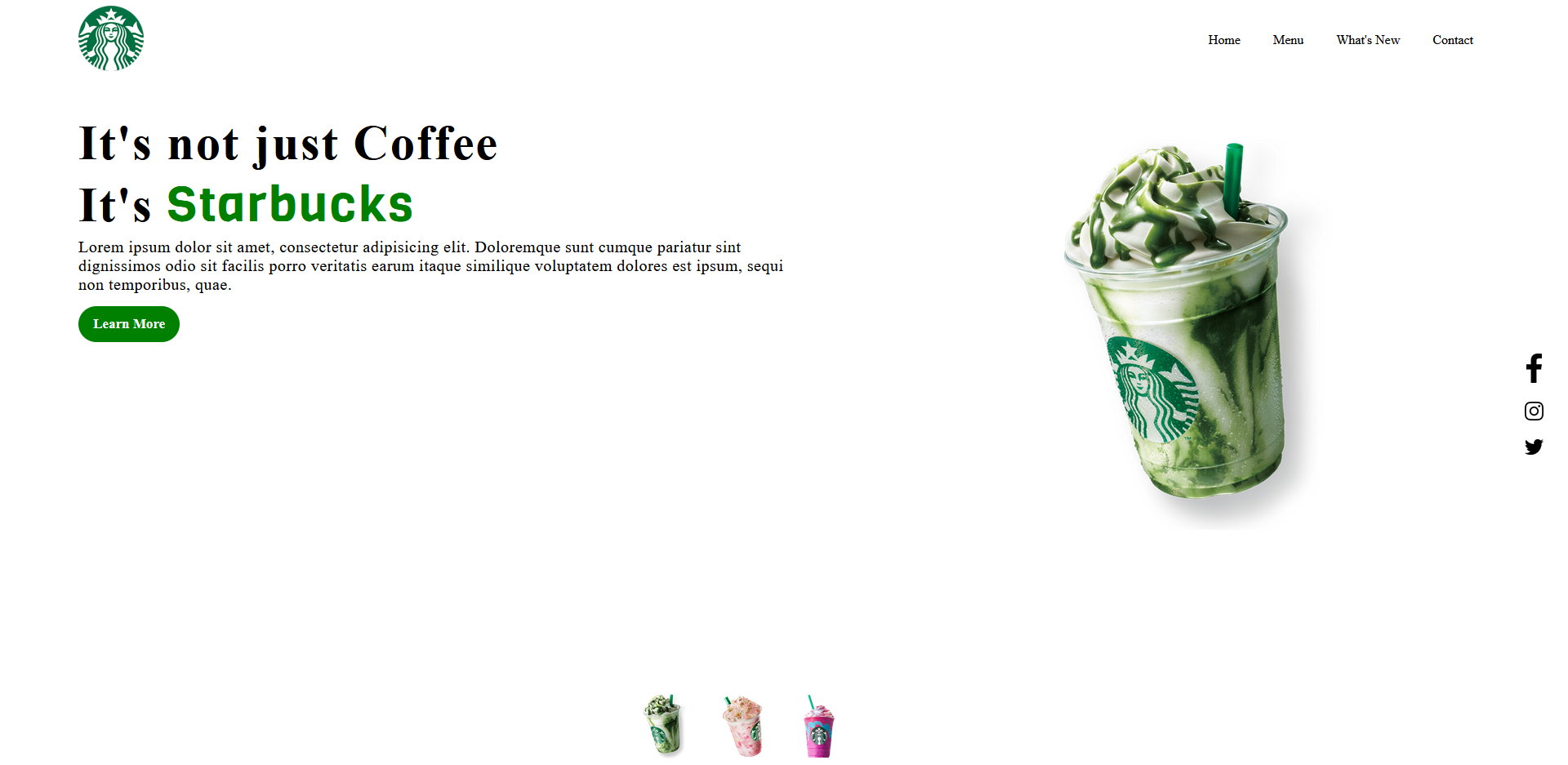
Creating a Starbucks-inspired landing page was an insightful web development venture. Here’s a concise overview of the process:
Designing Starbucks Vibes:
Selected earthy tones and Starbucks’ iconic green for a warm and inviting ambiance.
HTML and CSS Essentials:
Structured content with HTML and achieved responsive design with CSS.
JavaScript for Interactivity:
Used JavaScript for subtle animations upon page load, enhancing user engagement.
Prioritizing User Experience:
Ensured responsiveness across devices through CSS media queries.
Streamlined Navigation:
Added smooth scrolling and a sticky navigation bar for effortless user navigation.
Conclusion:
This project underscored the importance of detail, responsiveness, and immersive user experiences in web development. Like a perfectly brewed cup of coffee, a well-crafted landing page can leave a lasting impression. Whether you’re a seasoned developer or a beginner, embrace the chance to brew your creativity, one webpage at a time.
Steps To Create Starbucks Landing Page with HTML, CSS, and JavaScript
To build a Starbucks Landing Page using HTML and CSS, and javascript follow these steps
1: Create a folder. Create a folder inside with these names Named css img and js.
2: Create an index.html file. The file name must be index and its extension .html ( in main folder )
3: Create a style.css file. The file name must be style and its extension .css ( in css folder )
4:Create a script.js . in js file
5:click here to download images and store it in img file.
Here is index.html
<!DOCTYPE html>
<html lang="en" dir="ltr">
  <!-- codebyrolex visit our website https://codebyrolex.com   -->
  <head>
    <meta charset="utf-8">
    <meta name="viewport" content="width=device-width, initial-scale=1">
    <link rel="preconnect" href="https://fonts.gstatic.com">
    <link href="https://fonts.googleapis.com/css2?family=Viga&display=swap" rel="stylesheet">
    <link href="https://fonts.googleapis.com/css2?family=Poppins:wght@200&display=swap" rel="stylesheet">
    <title>Starbucks Landing Page</title>
    <link rel="stylesheet" href="css/styles.css">
  </head>
  <body>

    <header>
      <div class="left-side">
        <a href="#"> <img src="img/logo.png" alt=""> </a>
      </div>
      <div class="right-side">
        <div class="nav-link-wrapper"> <a href="">Home</a> </div>
        <div class="nav-link-wrapper"> <a href="">Menu</a> </div>
        <div class="nav-link-wrapper"> <a href="">What's New</a> </div>
        <div class="nav-link-wrapper"> <a href="">Contact</a> </div>
      </div>
    </header>

    <div class="container">

      <div class="left-side">
        <h1>It's not just Coffee <br>
          It's <span class = "green"> Starbucks </span>
        </h1>
        <p>Lorem ipsum dolor sit amet, consectetur adipisicing elit. Doloremque
           sunt cumque pariatur sint dignissimos odio sit facilis porro veritatis
           earum itaque similique voluptatem dolores est ipsum, sequi non temporibus,
           quae.</p>
        <a href="">Learn More</a>
      </div>
      <div class="right-side">
        <img src="img/img1.png" alt="" class = "starbucks">
        <div class="box">
          <a href="#"> <img class = "facebook" src="img/facebook.png" alt=""></a>
          <a href="#"> <img src="img/instagram.png" alt=""></a>
          <a href="#"> <img src="img/twitter.png" alt=""></a>
        </div>
      </div>
    </div>
    <div class="thumb">
      <a href = "#bottom"><img id = "bottom" src="img/thumb1.png" onclick="imgSlider('img/img1.png');"> </a>
      <a href="#bottom"><img src="img/thumb2.png" onclick="imgSlider('img/img2.png');"> </a>
      <a href="#bottom"><img src="img/thumb3.png" onclick="imgSlider('img/img3.png');"> </a>
    </div>

    <script src = "js/script.js">
    </script>
  </body>
</html>
Here is style.cs
*{
  margin: 0px;
  padding: 0px;
}
/* codebyrolex visit our website https://codebyrolex.com    */
body{
  overflow-x: hidden;
}

header{
  display: flex;
  align-items: center;
  justify-content: space-between;
  width: 90%;
  margin: 10px auto;
}

header .left-side a img{
  width: 80px;
}

header .right-side{
  display: flex;
}

header .right-side .nav-link-wrapper a{
  padding: 10px;
  margin: 10px;
  text-decoration: none;
  color: black;
}

.container{
  max-width: 80%;
  margin: 50px auto;
}

.container .left-side{
  text-align: center;
}

.container .left-side h1{
  font-size: 60px;
  letter-spacing: 2px;
}

.container .left-side h1 .green{
  color: green;
  font-family: 'Viga', serif;
}

.container .left-side p{
  font-size: 20px;
  letter-spacing: 0.5px;
}

.container .left-side a{
  display: inline-block;
  background: green;
  padding: 12px 18px 12px 18px;
  text-decoration: none;
  border-radius: 25px;
  color: white;
  margin-top: 15px;
  font-size: 17px;
  font-weight: bold;
}

.container .right-side{
  text-align: center;
  margin-top: 60px;
}

.container .right-side img{
  max-width: 50%;
}

.container .right-side .box{
  position: absolute;
  display: grid;
  right: 0%;
  bottom: 0%;
}

.container .right-side .box img{
  width: 25px;
  margin: 10px;
}

.container .right-side .box img.facebook{
  width: 18.5px;
}

.thumb{
  display: flex;
  margin-top: -60px;
  justify-content: center;
}

.thumb a:hover{
  margin-top: -15px;
  transition: 0.2s;
}

.thumb img{
  width: 54px;
  margin: 20px;
}

@media (min-width: 1140px){
  *{
    margin: 0px;
    padding: 0px;
  }

  body{
    overflow-x: hidden;
  }

  header{
    display: flex;
    align-items: center;
    justify-content: space-between;
    width: 90%;
    margin: 10px auto;
  }

  header .left-side a img{
    width: 80px;
  }

  header .right-side{
    display: flex;
  }

  header .right-side .nav-link-wrapper a{
    padding: 10px;
    margin: 10px;
    text-decoration: none;
    color: black;
  }

  .container{
    max-width: 90%;
    margin: 50px auto;
    display: flex;
  }

  .container .left-side{
    text-align: left;
    flex: 1;
  }

  .container .left-side h1{
    font-size: 60px;
    letter-spacing: 2px;
  }

  .container .left-side h1 .green{
    color: green;
    font-family: 'Viga', serif;
  }

  .container .left-side p{
    font-size: 20px;
    letter-spacing: 0.5px;
  }

  .container .left-side a{
    display: inline-block;
    background: green;
    padding: 12px 18px 12px 18px;
    text-decoration: none;
    border-radius: 25px;
    color: white;
    margin-top: 15px;
    font-size: 17px;
    font-weight: bold;
  }

  .container .right-side{
    flex: 1;
    text-align: center;
  }

  .container .right-side img{
    width: 330px;
    margin-left: 150px;
    margin-top: -30px;
  }

  .container .right-side .box{
    display: grid;
    position: absolute;
    bottom: 40%;
    right: 1%;
  }

  .container .right-side .box img{
    width: 25px;
    margin: 10px;
  }

  .container .right-side .box img.facebook{
    width: 18.5px;
  }

  .thumb{
    position: absolute;
    bottom: 0%;
    left: 40%;
  }

  .thumb a:hover{
    margin-top: -15px;
    transition: 0.2s;
  }

  .thumb img{
    width: 54px;
    margin: 20px;
  }
}

@media only screen and (max-width: 650px){
  header{
    display: block;
  }

  header .left-side a img{
    width: 80px;
    margin: auto;
    display: block;
  }

  header .right-side{
    display: flex;
    justify-content: center;
    margin-top: 35px;
  }

  header .right-side .nav-link-wrapper a{
    padding: 10px;
    margin: 10px;
    text-decoration: none;
    color: black;
  }
  .container{
    max-width: 80%;
    margin: 50px auto;
  }

  .container .left-side{
    text-align: center;
  }

  .container .left-side h1{
    font-size: 50px;
    letter-spacing: 2px;
  }

  .container .left-side h1 .green{
    color: green;
    font-family: 'Viga', serif;
  }

  .container .left-side p{
    font-size: 18px;
    letter-spacing: 0.5px;
  }

  .container .left-side a{
    display: inline-block;
    background: green;
    padding: 12px 18px 12px 18px;
    text-decoration: none;
    border-radius: 25px;
    color: white;
    margin-top: 15px;
    font-size: 16.2px;
    font-weight: bold;
  }
}

@media only screen and (max-width: 404px){
  header{
    display: block;
  }

  header .left-side a img{
    width: 80px;
    margin: auto;
    display: block;
  }

  header .right-side{
    display: flex;
    justify-content: center;
    margin-top: 35px;
  }

  header .right-side .nav-link-wrapper a{
    padding: 5px;
    margin: 5px;
    text-decoration: none;
    color: black;
  }
  .container .right-side img{
    width: 330px;
    margin-top: -30px;
  }
  .container .right-side img{
    max-width: 50%;
  }

  .container .right-side .box{
    display: none;
    position: absolute;
    bottom: 250px;
    right: 25px;
  }

  .container .right-side .box img{
    width: 25px;
    margin: 10px;
  }

  .container .right-side .box img.facebook{
    width: 18.5px;
  }

  .thumb{
    display: flex;
    margin-top: -30px;
    justify-content: center;
  }

  .thumb a:hover{
    margin-top: -15px;
    transition: 0.2s;
  }

  .thumb img{
    width: 45px;
    margin: 20px;
  }
}
Here is script.js
function imgSlider(anything){
  document.querySelector('.starbucks').src = anything;
}
// codebyrolex visit our website https://codebyrolex.com Output