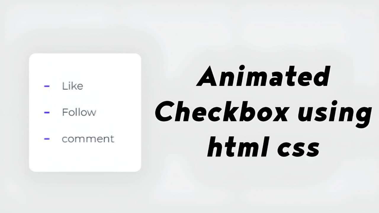
Output
HTML Structure:
The HTML code provided represents a simple checkbox list. Inside the <body> tag, there’s a <div> element with the ID checklist, containing a series of <input> elements of type checkbox, each followed by a <label> element. Each <input> has a corresponding <label> through the for attribute.
- The
<input>elements represent the check boxes, each with an ID and a value attribute. - The
<label>elements are associated with the check boxes via theforattribute, enabling users to click on the labels to toggle the check boxes.
<!DOCTYPE html>
<html lang="en">
<head>
    <title>Check Box - Codebyrolex</title>
    <link rel="stylesheet" href="style.css">
</head>
<body>
  <div id="checklist">
    <input checked="" value="1" name="r" type="checkbox" id="01">
    <label for="01">Like</label>
    <input value="2" name="r" type="checkbox" id="02">
    <label for="02">Follow</label>
    <input value="3" name="r" type="checkbox" id="03">
    <label for="03">Comment</label>
  </div>
</body>
</html>CSS
- Variables:
- The CSS code begins by defining custom properties using the
--syntax to set various colors, dimensions, and other styling attributes.
- Styling for Checklist Container (
#checklist):
- Sets up the background, dimensions, border-radius, and box-shadow for the container.
- Utilizes CSS Grid for layout and positioning of elements.
- Styling for Labels (
#checklist label):
- Defines styles for the labels associated with the check boxes.
- Specifies color, cursor type, and transitions for smooth animations.
- Styling for Pseudo-elements (
::beforeand::after):
- Utilizes pseudo-elements to create custom checkbox styles (ticks and circle indicators).
- Defines dimensions, positions, and background colors for these elements.
- Checkbox Styles (
#checklist input[type="checkbox"]):
- Hides the default checkbox appearance using
-webkit-appearanceand-moz-appearance. - Sets up dimensions, positioning, and background for the custom checkbox design.
- Checkbox Animation (
@keyframes):
- Defines key frame animations for various checkbox states, such as when checked or unchecked.
- Animations control the appearance and behavior of the custom check boxes and associated labels.
Animation Keyframes Explanation:
move: Adjusts padding to create a smooth animation effect when toggling check boxes.slice: Animates the appearance of the check mark.check-01andcheck-02: Define animations for the check mark.firework: Creates a fireworks effect when a checkbox is checked, using box-shadow and opacity properties.
#checklist {
  --background: #fff;
  --text: #414856;
  --check: #4f29f0;
  --disabled: #c3c8de;
  --width: 100px;
  --height: 180px;
  --border-radius: 10px;
  background: var(--background);
  width: var(--width);
  height: var(--height);
  border-radius: var(--border-radius);
  position: relative;
  box-shadow: 0 10px 30px rgba(65, 72, 86, 0.05);
  padding: 30px 85px;
  display: grid;
  grid-template-columns: 30px auto;
  align-items: center;
  justify-content: center;
}

#checklist label {
  color: var(--text);
  position: relative;
  cursor: pointer;
  display: grid;
  align-items: center;
  width: fit-content;
  transition: color 0.3s ease;
  margin-right: 20px;
}

#checklist label::before, #checklist label::after {
  content: "";
  position: absolute;
}

#checklist label::before {
  height: 2px;
  width: 8px;
  left: -27px;
  background: var(--check);
  border-radius: 2px;
  transition: background 0.3s ease;
}

#checklist label:after {
  height: 4px;
  width: 4px;
  top: 8px;
  left: -25px;
  border-radius: 50%;
}

#checklist input[type="checkbox"] {
  -webkit-appearance: none;
  -moz-appearance: none;
  position: relative;
  height: 15px;
  width: 15px;
  outline: none;
  border: 0;
  margin: 0 15px 0 0;
  cursor: pointer;
  background: var(--background);
  display: grid;
  align-items: center;
  margin-right: 20px;
}

#checklist input[type="checkbox"]::before, #checklist input[type="checkbox"]::after {
  content: "";
  position: absolute;
  height: 2px;
  top: auto;
  background: var(--check);
  border-radius: 2px;
}

#checklist input[type="checkbox"]::before {
  width: 0px;
  right: 60%;
  transform-origin: right bottom;
}

#checklist input[type="checkbox"]::after {
  width: 0px;
  left: 40%;
  transform-origin: left bottom;
}

#checklist input[type="checkbox"]:checked::before {
  animation: check-01 0.4s ease forwards;
}

#checklist input[type="checkbox"]:checked::after {
  animation: check-02 0.4s ease forwards;
}

#checklist input[type="checkbox"]:checked + label {
  color: var(--disabled);
  animation: move 0.3s ease 0.1s forwards;
}

#checklist input[type="checkbox"]:checked + label::before {
  background: var(--disabled);
  animation: slice 0.4s ease forwards;
}

#checklist input[type="checkbox"]:checked + label::after {
  animation: firework 0.5s ease forwards 0.1s;
}

@keyframes move {
  50% {
    padding-left: 8px;
    padding-right: 0px;
  }

  100% {
    padding-right: 4px;
  }
}

@keyframes slice {
  60% {
    width: 100%;
    left: 4px;
  }

  100% {
    width: 100%;
    left: -2px;
    padding-left: 0;
  }
}

@keyframes check-01 {
  0% {
    width: 4px;
    top: auto;
    transform: rotate(0);
  }

  50% {
    width: 0px;
    top: auto;
    transform: rotate(0);
  }

  51% {
    width: 0px;
    top: 8px;
    transform: rotate(45deg);
  }

  100% {
    width: 5px;
    top: 8px;
    transform: rotate(45deg);
  }
}

@keyframes check-02 {
  0% {
    width: 4px;
    top: auto;
    transform: rotate(0);
  }

  50% {
    width: 0px;
    top: auto;
    transform: rotate(0);
  }

  51% {
    width: 0px;
    top: 8px;
    transform: rotate(-45deg);
  }

  100% {
    width: 10px;
    top: 8px;
    transform: rotate(-45deg);
  }
}

@keyframes firework {
  0% {
    opacity: 1;
    box-shadow: 0 0 0 -2px #4f29f0, 0 0 0 -2px #4f29f0, 0 0 0 -2px #4f29f0, 0 0 0 -2px #4f29f0, 0 0 0 -2px #4f29f0, 0 0 0 -2px #4f29f0;
  }

  30% {
    opacity: 1;
  }

  100% {
    opacity: 0;
    box-shadow: 0 -15px 0 0px #4f29f0, 14px -8px 0 0px #4f29f0, 14px 8px 0 0px #4f29f0, 0 15px 0 0px #4f29f0, -14px 8px 0 0px #4f29f0, -14px -8px 0 0px #4f29f0;
  }
}In summary, the provided CSS code customizes the appearance and behavior of check boxes using advanced CSS techniques like custom properties, pseudo-elements, and key frame animations. It enhances user experience by adding visually appealing animations to checkbox interactions.